Comparing graphs of air pollution in Kamloops - Provincial monitor versus PurpleAir
The low-cost PurpleAir network acts like a "swarm" to provide more detailed data - at various locations - on air quality.
The strength of this approach is to use all sensors in a region to understand more fully how air quality varies by elevation, proximity to a pollution source, and other factors. It's also very helpful to have multiple readings from independent devices.
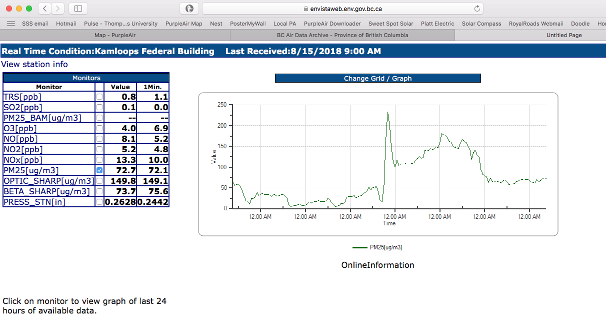
Here's another example of how the technology compares to the provincial air quality monitoring program. This example is a snapshot of several days of averaged data which compares the provincial monitor in Kamloops to the closest PurpleAir sensor.
Note how the trend lines track each other.


The strength of this approach is to use all sensors in a region to understand more fully how air quality varies by elevation, proximity to a pollution source, and other factors. It's also very helpful to have multiple readings from independent devices.
Here's another example of how the technology compares to the provincial air quality monitoring program. This example is a snapshot of several days of averaged data which compares the provincial monitor in Kamloops to the closest PurpleAir sensor.
Note how the trend lines track each other.


Comments
Post a Comment