How to understand PurpleAir sensor readings
Air pollution has a unique signature depending on the source or sources, location, baseline, magnitude of change, and the mechanisms by which it is produced. Here are some simple ways to identify what's happening when reading PurpleAir monitors like what we have here.
The first image is from a rural community. Note the good quality air with PM2.5 levels between 1 and 2 with a sudden but short-lived spike to 7.5 at 11:15AM. This is a pattern I have seen before and it represents a dirty diesel truck (most likely a water truck) going past the sensor.

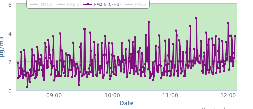
The second image represents normal variation on a good air quality day.
The third image is from a city with the sensor reflecting activity from a local pulp and paper mill and local traffic.

The last image is a rural community snapshot of a good day punctuated by what happens when a wood stove or fireplace is lit nearby. Note the sudden and dramatic increase in pollution and the saw tooth pattern as the stove get to a higher temperature, but when opened and new wood is introduced, the spike occurs again but it's usually not as high as the initial lighting.


Comments
Post a Comment